Driving on roads worldwide requires more than just the ability to operate a vehicle. Understanding and obeying traffic signs is crucial for the safety and efficiency of all road users. Regulatory signs are paramount among the myriad of traffic signs you’ll encounter. They convey specific regulations and laws that drivers must adhere to. But what color are these regulatory signs? This article dives deep into the significance, categorization, and importance of the color of regulatory signs.
Understanding Regulatory Signs
Before delving into the color specifics, it’s essential to comprehend what regulatory signs are. In road signage, regulatory signs convey specific rules, regulations, or requirements. Whether you’re a novice or an experienced driver, obeying these signs is not optional; it’s mandatory. Non-compliance doesn’t just lead to potential fines or penalties but can also result in hazardous driving conditions.
The Color Palette of Road Signs: A Comprehensive Overview
Traffic signs are an integral part of the transportation ecosystem. Their primary function is to guide, warn, and inform road users, ensuring a smooth and safe traffic flow. At the heart of this communication system lies a color palette designed to convey specific, instantly recognizable messages. Let’s delve into the nuances of each color and its purpose in road signage.

1. Red: The Color of Alertness
Purpose: Red is arguably the most arresting color in traffic signage, catching the eye and demanding immediate attention.
Usage: This color predominantly represents warnings and prohibitions. For instance:
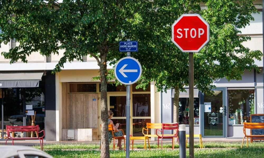
- Stop signs are octagonal and red, ensuring they cannot be missed.
- No Entry signs are typically a red circle with a white rectangle across the middle.
- Warning signs about prohibitions, such as no parking or no-overtaking zones, use red as a prominent feature.
Significance: Red inherently signals danger or caution, helping road users recognize when an immediate response is required or when a specific action is prohibited.
2. Blue: Following Instructions
Purpose: Blue is synonymous with calm, trust, and reliability. In the context of road signs, it offers clear instructions.
Usage:
- Motorway signs indicating exits, junction numbers, and services use blue backgrounds.
- Parking zones and informational signs also employ blue.
Significance: The calming hue of blue assures drivers that they’re being guided correctly, whether to continue on a motorway or find nearby amenities.
3. Yellow: Proceed with Caution
Purpose: Yellow, being highly visible even from a distance, signals caution.
Usage:
- Construction zones or temporary changes in road patterns often use yellow signs to alert drivers.
- Hazard warnings like slippery roads or merging traffic might also use yellow.
Significance: Yellow’s visibility, especially in dim lighting or adverse weather, ensures drivers are alerted to potential hazards ahead.
4. White: The Clarifier
Purpose: White, being neutral, serves as a backdrop for clearer, direct messages.
Usage:
- Regulatory signs, such as speed limits, employ a white background.
- Signs indicating general regulations, like lane usage, are also in white.
Significance: The stark contrast between the white background and black or red symbols/letters ensures maximum readability, helping drivers quickly understand the sign’s message.
5. Green: Guiding Your Way
Purpose: Green is associated with direction and guidance.
Usage:
- Highway exit signs or directional signs often use green.
- Distance markers or signs indicating the next city or town are typically in green.
Significance: Green signs provide a sense of direction, ensuring drivers know where they are headed and how far they need to go.
6. Brown: The Tourist’s Guide
Purpose: Brown, earthy, and natural is the designated color for points of interest.
Usage:
- Historical sites, national parks, or landmarks are indicated with brown signs.
- Tourist attractions and scenic spots also use this color.
Significance: Brown signs act as a guide for tourists and locals alike, pointing them toward sites of cultural, historical, or natural significance.

The Color of Regulatory Signs
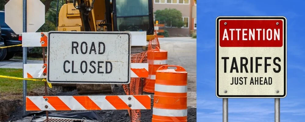
Regulatory signs are primarily white, particularly in countries like the United States. The white background starkly contrasts the black, red, or blue symbols or text on them, ensuring the message is clear and visible, even from a distance. This white-and-black combination is internationally recognized and understood, even by those who might not be familiar with the local language.
In the U.S., for instance, speed limit signs, “No U-Turn” signs, and “No Parking” signs are all examples of white regulatory signs with black or red inscriptions. This stark contrast is deliberate, ensuring maximum visibility both day and night.
Why White for Regulatory Signs? Understanding the Rationale
Road signs play a critical role in guiding, instructing, and ensuring the safety of all road users. White for regulatory signs stands out among the myriad of colors employed in road signage. This choice isn’t arbitrary; it’s rooted in design principles, psychology, and practical considerations.
1. High Visibility: Ensuring Signs Are Seen
By its very nature, White has a high albedo, reflecting a significant portion of the light that falls on it. This makes white signs:
- Easy to spot: Whether it’s daytime or nighttime, sunny or overcast, the reflective properties of white ensure the sign remains noticeable.
- Less prone to fading: White retains its integrity over time, ensuring that even weather-beaten signs remain relatively visible.
- Efficient for illumination: In conditions where artificial illumination (like streetlights or headlights) is the primary light source, white signs bounce back the light efficiently, ensuring they remain readable.
2. Universality: Breaking Language and Cultural Barriers
As globalization increases and cross-border travel becomes commonplace, the need for universally understood symbols and colors is paramount.
- Consistency across borders: Many countries worldwide have adopted the white background for regulatory signs. This consistency aids international drivers, ensuring they understand essential regulations even when driving abroad.
- Reduction in cognitive load: With standardized white and black combinations, drivers don’t have to process new color combinations or designs, leading to quicker reaction times.
3. Contrast: Maximizing Readability
One of the primary objectives of any sign is to convey its message clearly and quickly. The contrast between foreground and background colors is pivotal in achieving this.
- Instant recognition: The stark contrast between black symbols or text and a white background ensures drivers can discern the sign’s message in a split second, aiding in quick decision-making.
- Reduced ambiguity: High contrast reduces the chances of misinterpretation. This clarity can distinguish between safe driving and potential mishaps in rapidly changing driving conditions.
- Versatility: The white background serves as a versatile canvas. It allows various symbols, numbers, and letters in black (or sometimes other colors) to stand out, making it suitable for diverse regulatory messages.

Regulatory Signs Beyond Color: A Multifaceted Approach to Traffic Management
The world of road signage is an intricate dance of design, psychology, technology, and engineering. While color remains a cornerstone in the design and interpretation of regulatory signs, it is just one part of a more comprehensive system. To truly appreciate the effectiveness of regulatory signs, we must consider all contributing factors and the emerging trends that are reshaping our roads’ informational landscape.
1. Shapes: A Universal Language on the Road
The shape of a road sign provides immediate information, sometimes even before the driver can register the sign’s color or content.
- Unambiguous communication: Distinct shapes like the octagon for STOP or the triangle for warnings are universally recognized, eliminating confusion.
- Quick interpretation: Shapes are processed rapidly by the human brain, ensuring immediate comprehension, which is especially vital in high-speed scenarios.
2. Placement: Ensuring Timely Visibility
Strategic placement of signs ensures that they are easily and promptly visible to drivers.
- Height considerations: Signs are placed at specific heights to ensure they are not obscured by other vehicles or roadside vegetation.
- Angle and orientation: Regulatory signs are angled optimally to ensure drivers in near and far lanes can view them clearly.
- Sequential placement: In situations requiring multiple instructions (like an upcoming turn followed by a speed limit change), signs are spaced appropriately to give drivers time to process each message.
3. Size Matters: Tailoring to the Environment
The size of regulatory signs varies depending on the road’s nature, whether it’s a high-speed highway or a residential lane.
- Enhanced visibility: Larger signs in high-speed zones ensure they are visible from a distance, giving drivers more reaction time.
- Proportional sizing: In pedestrian-heavy areas or zones with lower speed limits, signs might be smaller but remain proportionate to ensure readability.

The Evolving Landscape of Regulatory Signs: A Glimpse into the Future
As technology continues to progress, it is inevitably influencing the realm of road signage.
1. Digital Signage: Flexibility in Communication
The static nature of traditional signs gives way to dynamic digital displays in some regions.
- Real-time adaptability: Digital signs can be updated in real-time, reflecting changes in speed limits during different times of the day or indicating detours due to unexpected incidents.
- Enhanced visibility: These signs often have illuminated displays, ensuring clear visibility even in adverse weather conditions.
2. Vehicle Integration: The Car as an Interpreter
The rise of smart vehicles equipped with advanced driver assistance systems (ADAS) is revolutionizing how we interact with road signs.
- Active feedback: Systems recognizing regulatory signs can alert drivers with visual or auditory cues, ensuring compliance.
- Predictive analysis: Advanced systems can even anticipate upcoming signs based on location data, preparing the driver in advance.
Conclusion
While grounded in tradition, regulatory signs are evolving at the crossroads of design innovation and technological advancements. The multifaceted nature of these signs—encompassing color, shape, size, and placement—ensures they effectively regulate traffic and maintain road safety. As we drive into the future, the integration of digital solutions promises even more responsive and adaptive regulatory sign systems.

