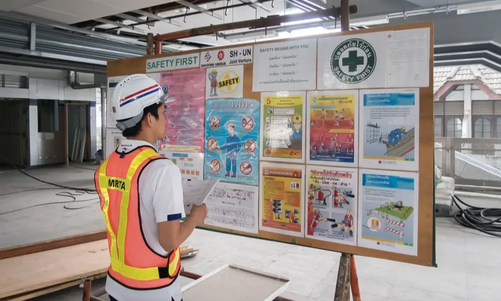
Safety isn’t a suggestion; it’s a necessity. Clear and compelling safety signboards in the workplace are your silent guardians, constantly communicating hazards and guiding you toward safe practices.
This blog delves into the world of safety signage, examining types, effective placement, and their crucial role in preventing accidents and promoting a safer work environment. Whether you’re an employer or an employee, get ready to understand the language of safety signs – it could just save a life.
What are Safety Signboards?
Safety signboards are visual displays that communicate hazards, instructions, and important safety information within a workplace or public space. They use a combination of the following:
- Shapes: Geometric shapes to quickly indicate the general category of the message
- Colors: Bold colors draw attention and signify the level of danger
- Symbols/Pictograms Universally recognized images for easy comprehension regardless of language barriers.
Purpose of Safety Signboards
- Warn of hazards: Alert people to dangers such as chemicals, electricity, moving machinery, etc.
- Provide mandatory instructions: Indicate actions that must be taken, like wearing protective equipment.
- Prohibit unsafe behaviors: Clearly communicate actions that are not allowed to prevent accidents.
- Show the location of safety equipment: Guide people to fire extinguishers, first-aid kits, emergency exits, etc.
Where To Place The Safety Signboards
Safety signboards should be strategically placed in areas easily visible to at-risk individuals or requiring information about safety procedures. Here are some general guidelines on where to place safety signboards:
General Principles
- High Visibility: Place the signs where they’ll be most noticeable, ideally at eye level.
- Clear pathways: Position signs so they don’t obstruct walkways, exits, or emergency equipment.
- Proximity to Hazard: Install the signboards near the hazard they warn about.
- Durability: Use materials that can withstand the conditions of the work environment.
- Lighting: Ensure the signs are well-lit or even illuminated in low-light conditions.
Specific Locations
- Hazard Areas: Entrances to hazardous zones, locations near machinery, areas with specific dangers (electrical, chemical, etc.).
- Exit Routes: Clearly mark emergency exits, fire escape paths, and assembly points.
- Safety Equipment: Near fire extinguishers, first-aid kits, emergency showers, and eye wash stations.
- Mandatory Actions: At points where personal protective equipment (PPE) is required.
- Work Procedures: Where specific safety instructions need to be followed.
Additional Tips
- Multiple Signs: Use multiple signs if a hazard is present over a large area or is visible from different angles.
- Size Matters: Adjust sign size according to visibility requirements and the distance from which they must be read.
- Consistency: Utilize a consistent system of colors, shapes, and symbols across the workplace for efficient recognition.
- Updates: Review and update placement according to changes in the work environment or regulations.
Remember: Proper placement of safety signboards is crucial. It ensures maximum visibility and promotes adherence to safety protocols, ultimately minimizing work-related accidents and incidents.
Design and Features Of Safety Signboards
When discussing the design and features of safety signboards, it’s important to consider several key elements that contribute to their effectiveness in conveying important safety information. Here’s a breakdown of the design and features:
Design Elements
- Shape: Indicates the message type (circle with slash for prohibition, triangle for warning, etc.)
- Color: Conveys urgency (red for danger, yellow for warning, blue for mandatory, green for safety).
- Symbols: Simple, universally understood pictograms for quick recognition.
- Text: Brief and clear to reinforce the message.
Features for Effectiveness
- Clarity: Easy to understand with a simple design.
- Durability: Materials should withstand the placement environment.
- Size: Large enough to be read from the intended distance.
- Contrast: High-contrast colors for visibility.
- Lighting: Consider illumination for low-light areas.
- Multilingual: Use multiple languages if necessary.
Regulations
Countries often have regulations for safety sign design (e.g., OSHA in the US, ISO internationally). Always check your local guidelines.
For further guidance, you can refer to resources like:
- OSHA Standards for Safety Signs: https://www.osha.gov/laws-regs/regulations/standardnumber/1910/1910.145
- Guides from Safety Equipment Suppliers: Many suppliers provide detailed guides on sign placement.
Conclusion
Remember, safety signboards aren’t just decorations; they’re vital to any workplace safety strategy. By understanding their types, proper placement, and the messages they convey, we create a safer environment for everyone. Don’t underestimate the power of these visual warnings – heed their guidance and let them be your constant reminder that safety is always the top priority.

